With the recent release of GDP numbers for year ended 2013 it’s an appropriate time to update the action zone – the historical trading range for the Dow Jones Industrial Average.
The action zone is a dynamic range affected by ever changing conditions such as inflation, economic activity, and stock market multiples. It’s meant to be a gauge for assessing stock market values defined by three average price points: a high, low, and middle valuation.
Questions like when to buy or sell, or how to appropriately balance your asset allocations to current risk tolerances are much easier to answer with action zone guidance. Below is a long-term look at the newly calculated Action Zone.
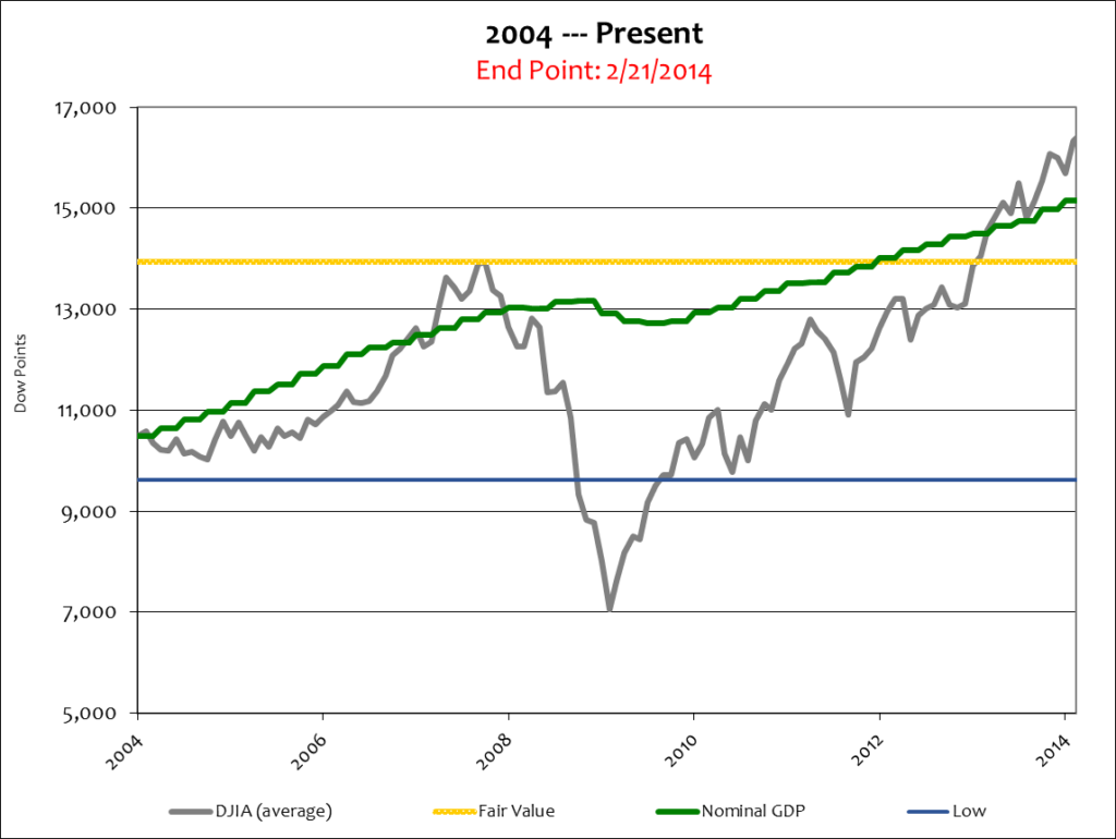
A few things jump out at me when looking at the above chart…
First, by leaping over Nominal GDP the Dow has been indicating a Bull Market since April 2013. A Bull Market is one where the stock market leads an expanding economy upward. Indeed it has taken a long time and a lot of QE to get the Dow up to this point –but should it keep going?
Historically “the market” trades substantially above Nominal GDP during times of robust economic growth, like the tech-boom and housing-boom. It should not be forgotten, however, that the Dow has performed several portfolio changes since the ’08 crash. That will serve as a double edged sword in the near term. The new portfolio forced mutual funds to buy the new Dow components (which forced “the market” higher) even though those new components were already over-valued when they were placed into the Average (this will force “the market” lower during the next correction.) See: Deal – What Deal? for more information.
The second thing that strikes me in the above chart is inflation. Now I know the government loves to say that inflation is mute or hard to see, but the difference between the top green line and the green-dotted line below it is the definition of inflation (Nominal GDP minus Real GDP = Inflation). At the present time there is at least 1,650 points of inflation in “the market.” The action zone makes that easy to see.
Inflation was 13% during the chart’s span; the Dow was up 25%, while the economy grew at just 8.5% in Real terms – a mere 1.9% per year. In other words, half of “the market’s” performance gain was due to inflation, not economic activity.
That’s what makes stocks so pricey here – there is no economic boom yet stocks are being valued as if one is ongoing.
Knowing that new Federal Reserve chairwoman Janet Yellen has committed to sticking to Ben Bernanke’s QE taper plan, stocks will need some other kind of support to maintain their high level – and there isn’t any.
The QE-boom is ending, the economy continues to limp along, labor participation is at a 40 year low, government fiscal prudence is non-existent at least until March of 2015, and ObamaCare will hurt future economic activity way more than dreadful winter weather will affect GDP for the first quarter of 2014.
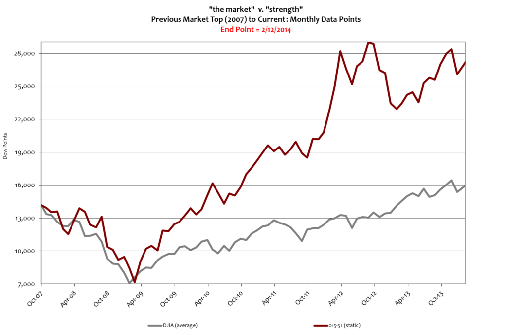
Nevertheless, if you’re going to be in the stock market at any level your best bet is with a long-term view and a superior 15-51 portfolio. It really does change the investment picture.
Stay tuned…
![]()